Who: Non-governmental organization Agenda Antártica, an organization committed to the environmental preservation of the Antarctic; with Publicis Toronto for strategy and creative; The Pub for production; and North Strategic on PR.
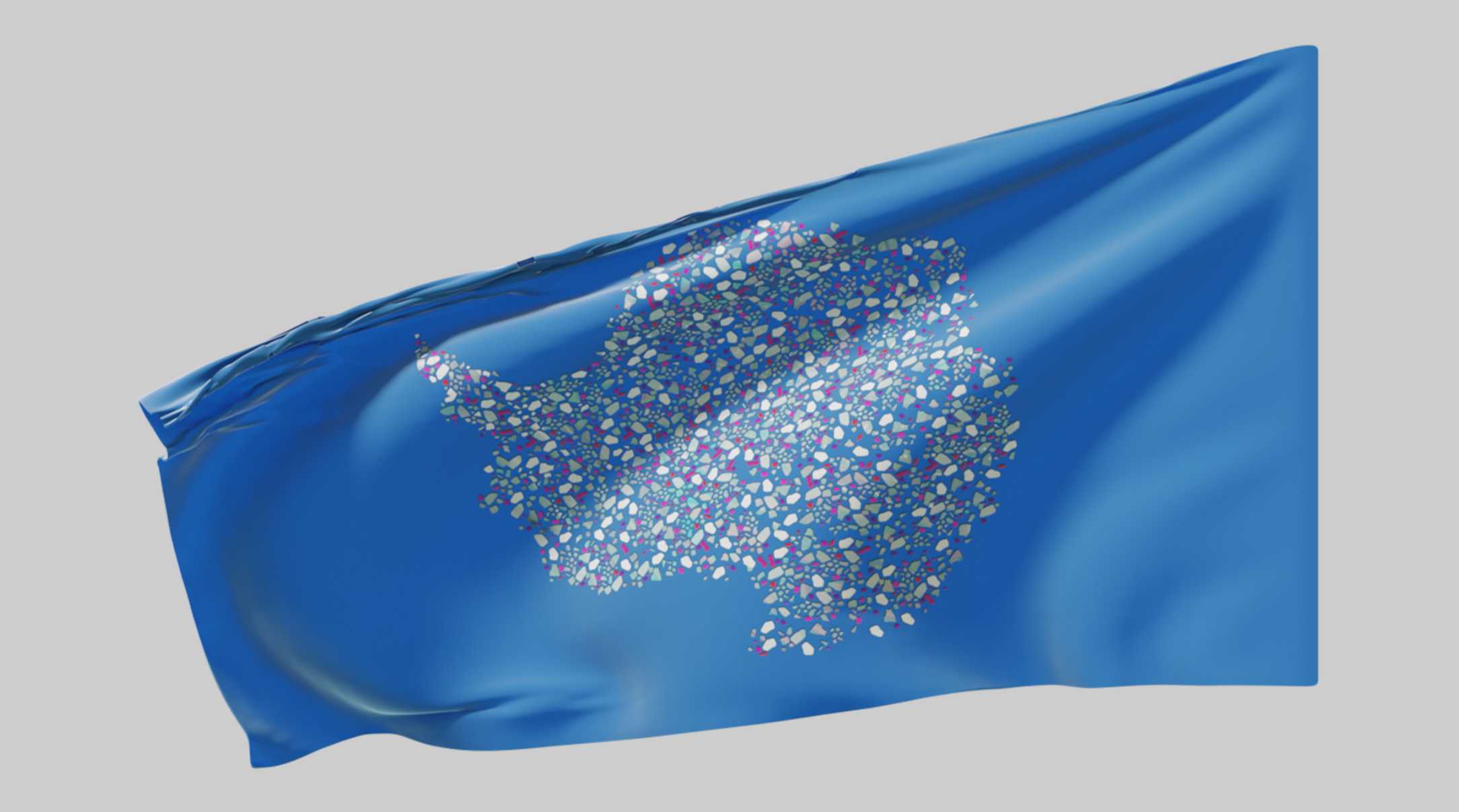
What: An awareness initiative underpinned by a reimagining Antarctica’s flag as originally conceived by vexillologist Graham Bartram in 1996.
When & Where: The flag’s redesign is part of a larger awareness effort that includes the launch of a dedicated microsite, and a pledge to support the NGO’s activist efforts to establish a global plastics treaty that will help combat plastic pollution. Digital videos that feature Bartram – in both 40-second and 100-second cuts – round out the effort.
Why: The goal is to show the pervasiveness of microplastics globally by documenting their presence in one of the most remote places on the planet. It’s supported by new research conducted at the University of Canterbury in New Zealand that involved collecting snow samples from 19 sites across the continent for testing. Those tests showed an average of 29 microplastic particles in the melted snow.
“The first scientific research explicitly focusing on microplastics is often credited to a study from 1972. Fifty-two years later, scientists found microplastics for the first time in Antarctic snow,” said Vini Dalvi, chief creative officer at Publicis Canada. “The presence of microplastics in remote areas like Antarctica serves as a stark wake-up call, highlighting the global extent of plastic pollution.
“By showcasing how pervasive microplastics are, even reaching the most pristine environments, the aim is to mobilize global efforts toward reducing plastic use and improving waste management,” he added. “Such revelations underscore the interconnectedness of global ecosystems and the urgent need for collective action against pollution.”
How: The redesigned flag serves as the campaign’s key visual. The pure white depiction of Antarctica as it appears on world maps and the original flag has been updated by Bartram to introduce more colour, representing the spread of microplastics across the continent.
“Flags are probably one of the most powerful symbols in the world,” said Dalvi. “They’re a way for a land to portray itself to the rest of the world and let people clearly visualize what is often very hard to see. That is why we decided to work around the idea of updating the Antarctic flag to help show the world the new reality of the continent.”
The flag’s design shows great attention to detail, capturing the variety of shapes of microplastics found on the continent, as well as the various particle hues. “The new flag serves as a real-time visualization of what Antarctica looks like now,” said Dalvi.


